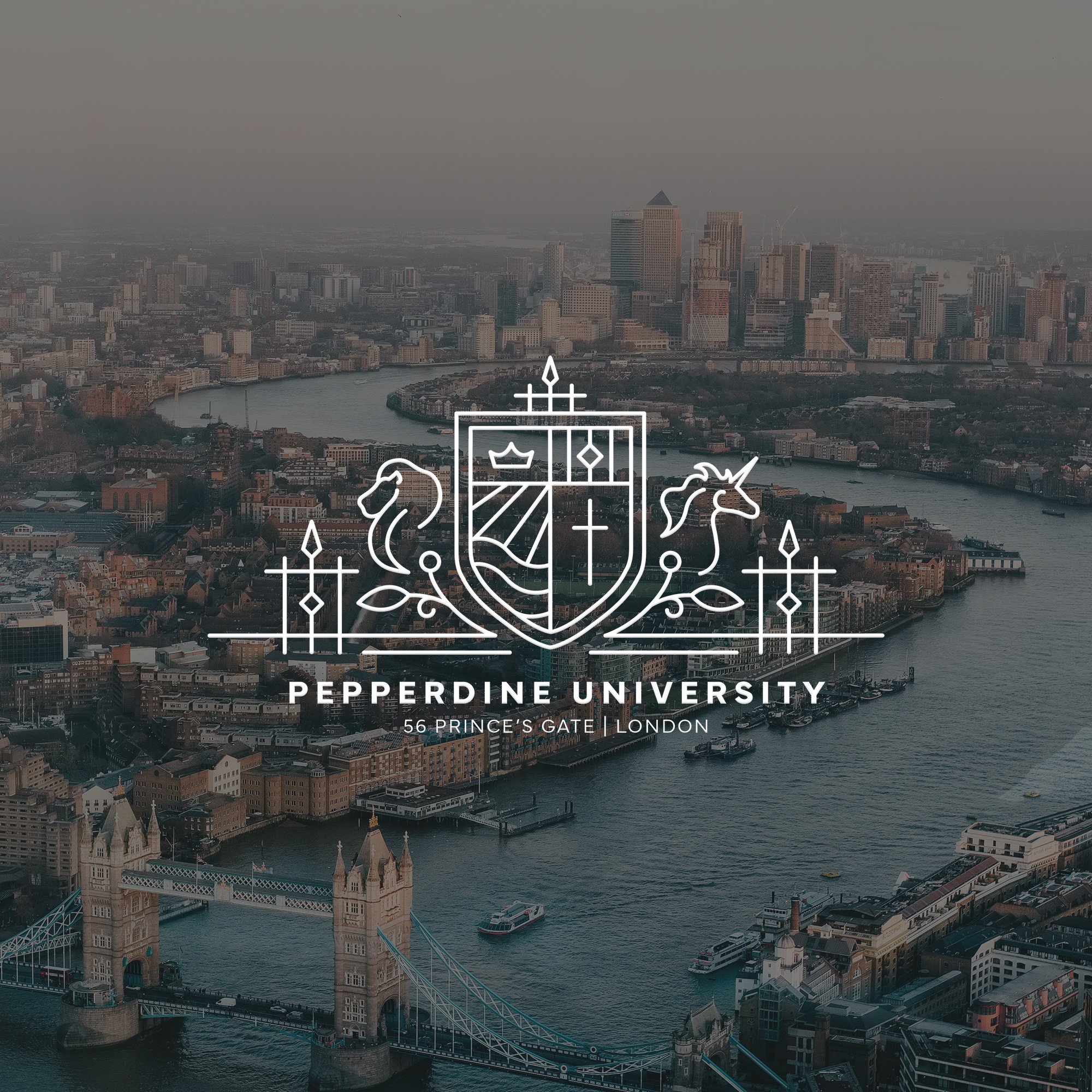
streamlined brand package
Pepperdine University London

THE CLIENT
Pepperdine University is a private research university based in Los Angeles with study abroad programs across Europe and Japan. Founded in the late 1980s, Pepperdine’s London program houses students and faculty year-round in the historic Prince’s Gate development of South Kensington.
the problem
Despite acting as a branch of Pepperdine University, the London program didn’t have its own logos, marks, or visual identity. The program needed its own brand that both anchored it to the University as a whole and provided a unique, modern, distinctly London point of view.
THE INSPIRATION
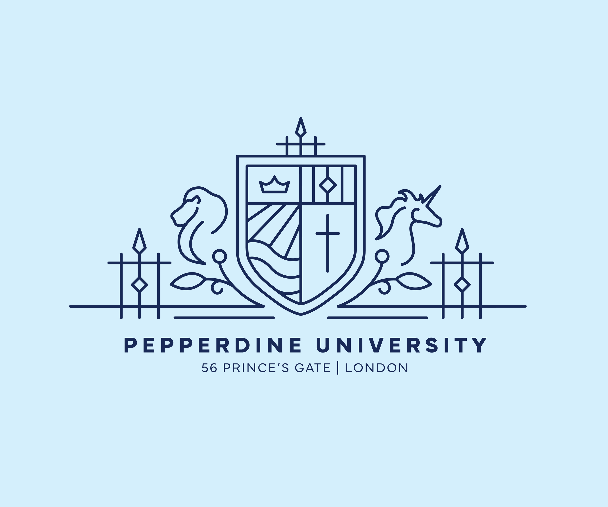
In our initial discovery conversations, the Pepperdine London team were clear that the program’s physical location played a monumental part in its identity. We agreed that the architecture of the London program’s home in South Kensington should be featured prominently in the new visuals, along with clear references to the main campus in California.
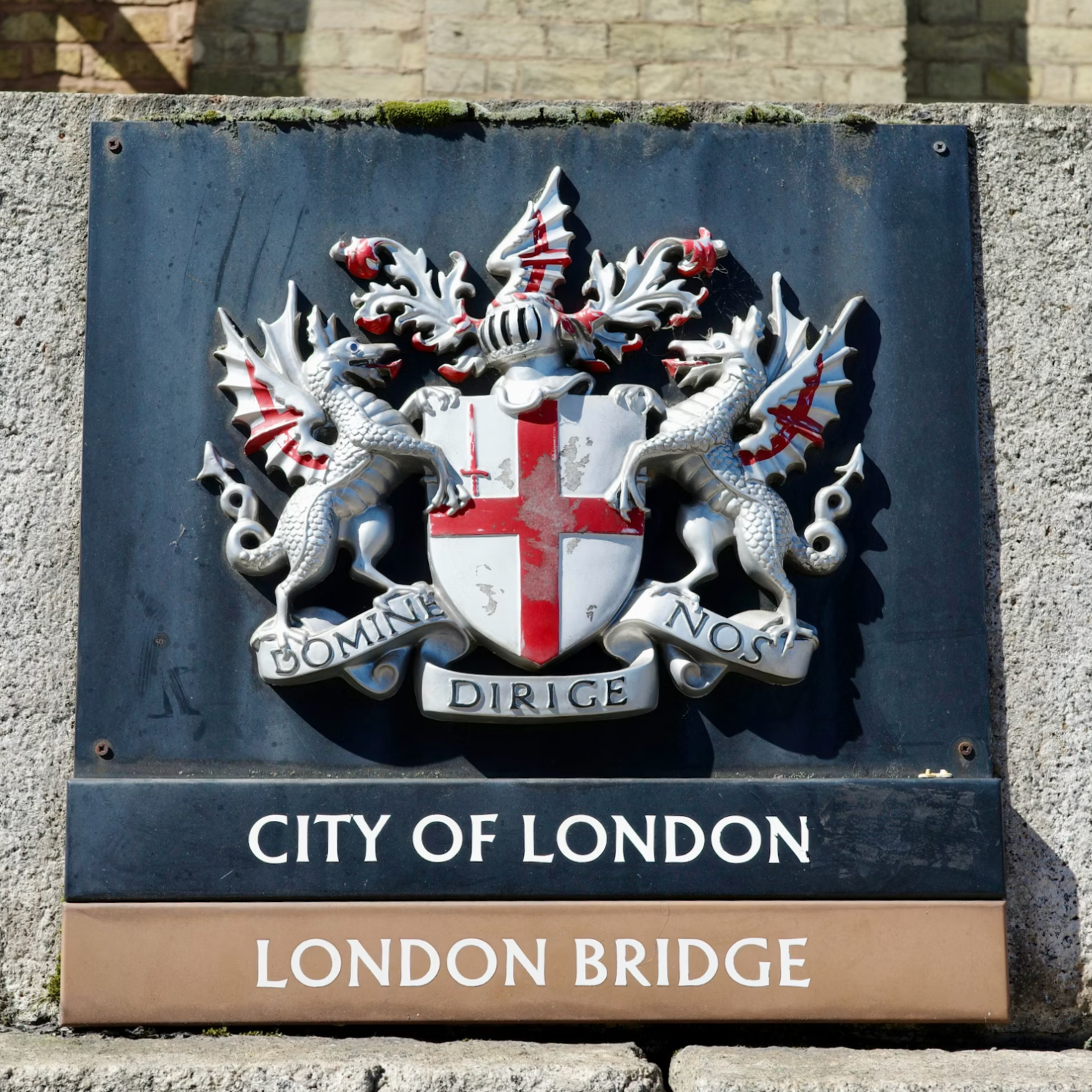
SHIELDS & CRESTS
featured prominently throughout historic London.
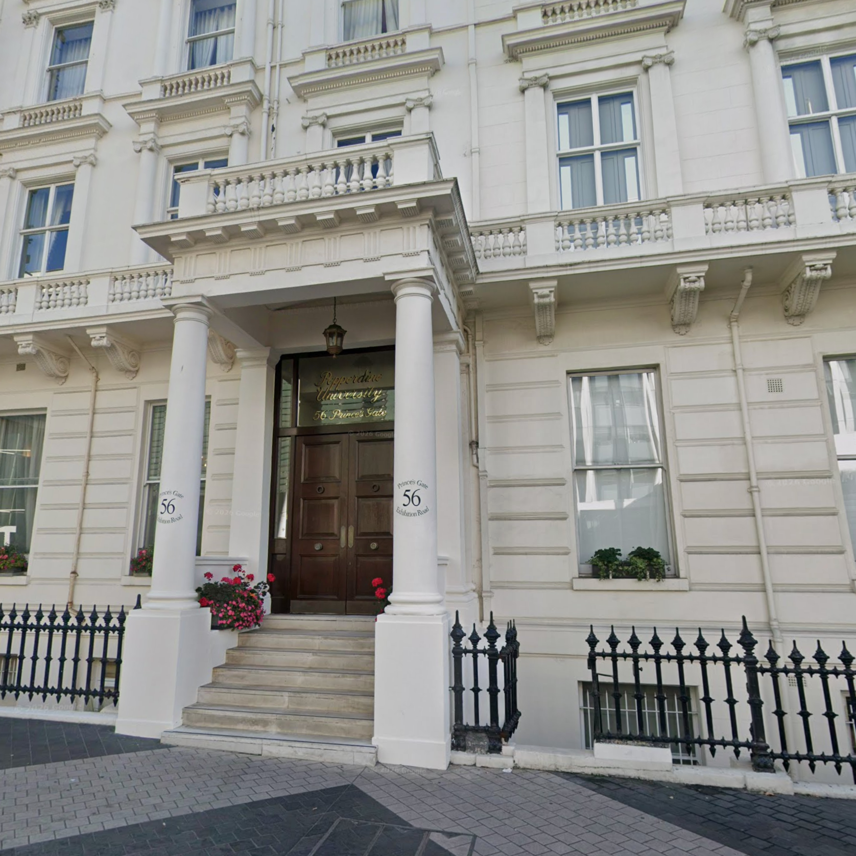
WROUGHT IRON GATES
a distinct architectural feature of the South Kensington building.
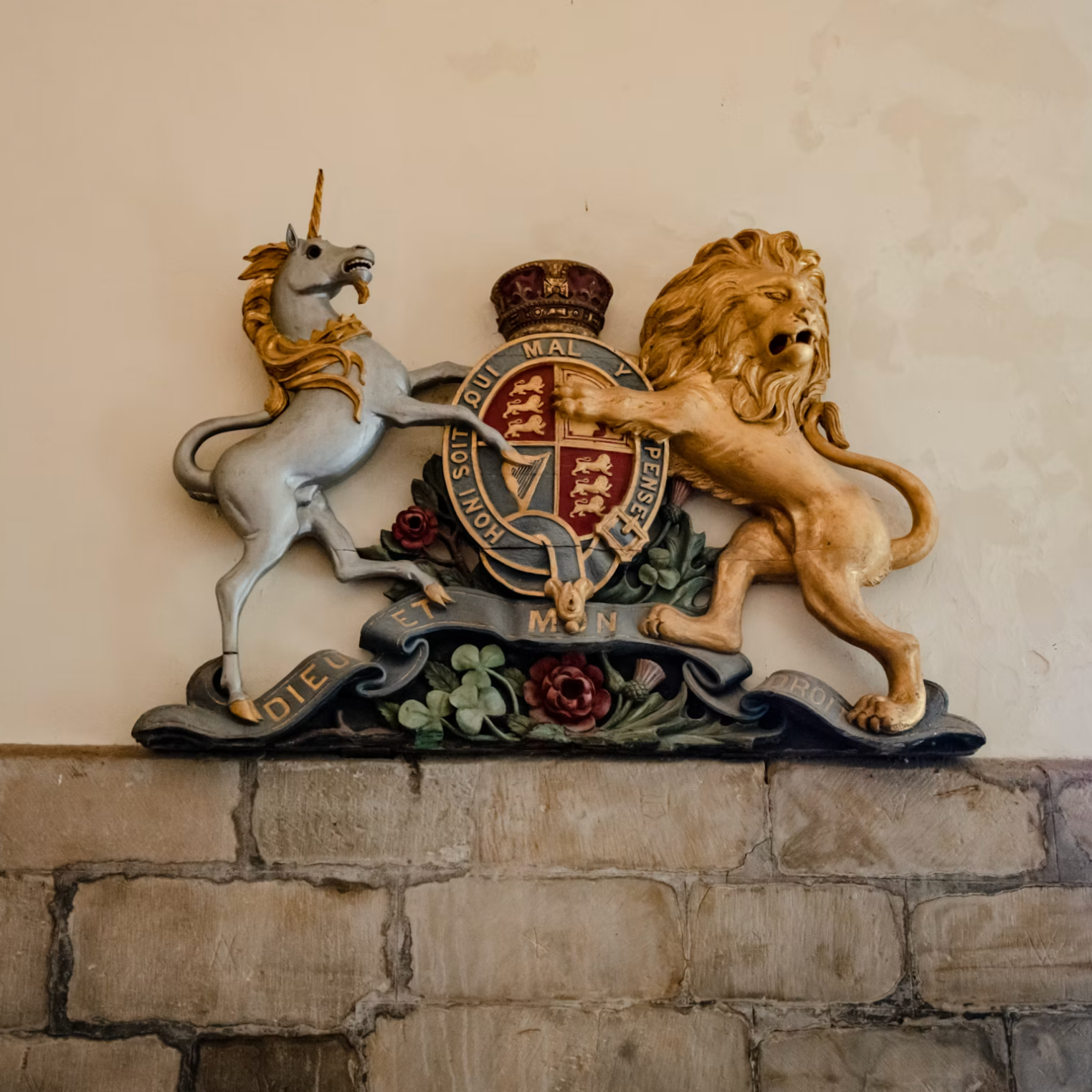
LIONS & UNICORNS
references to Christ and commonly found in English crests, including the Royal Coat of Arms of the UK.

MALIBU CAMPUS
architectural and geographic references.
the work
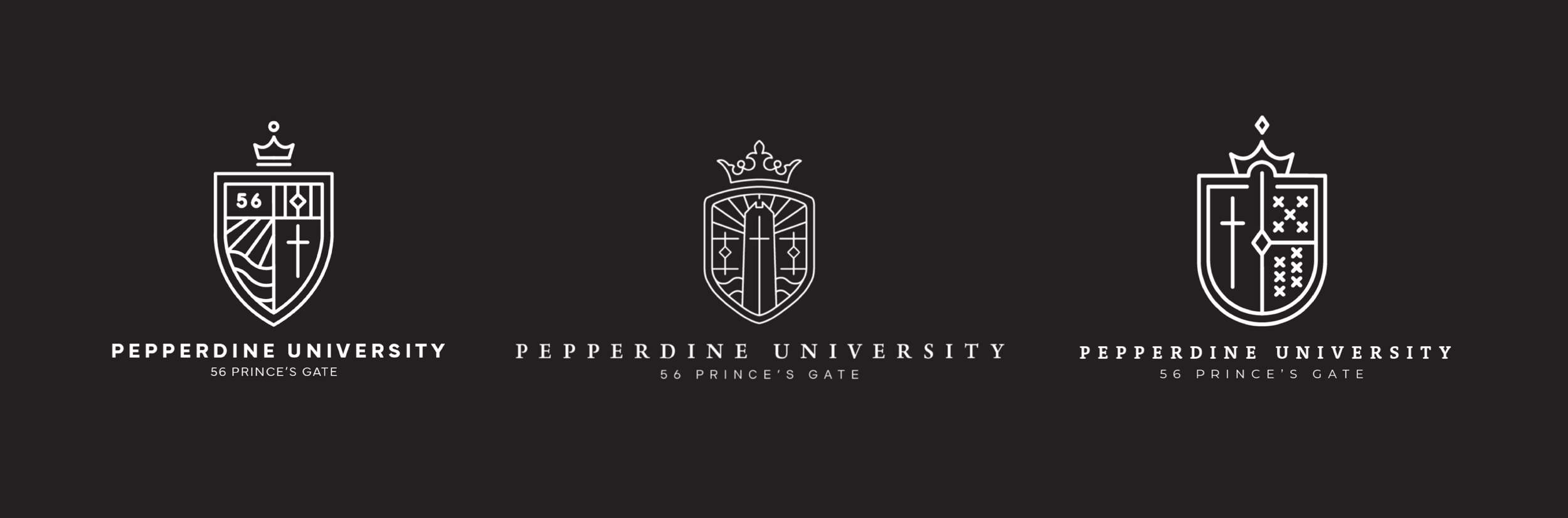
Early full build-out options played with typography and style.
Initial versions of the logo experimented with different crest shapes, varying levels of detail and a range of modern and traditional elements.
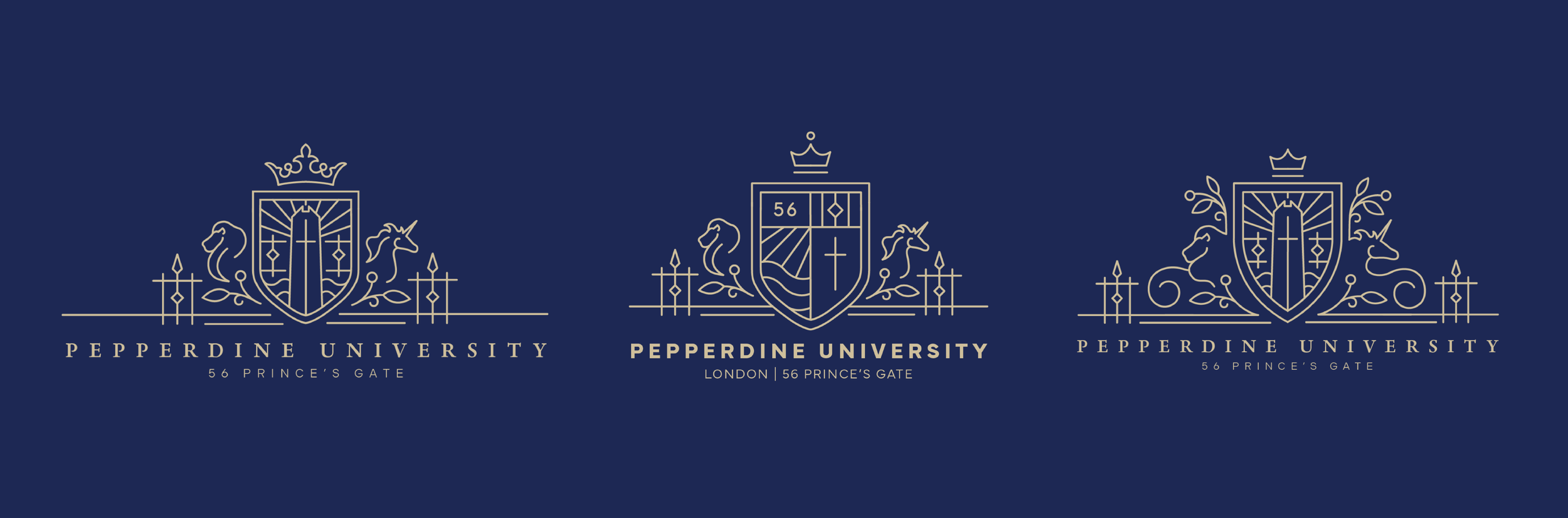
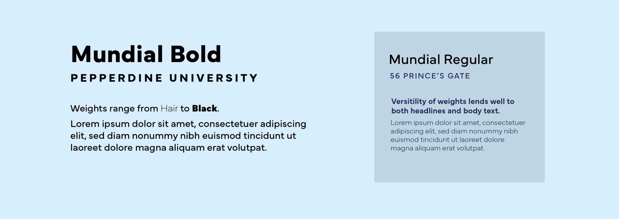
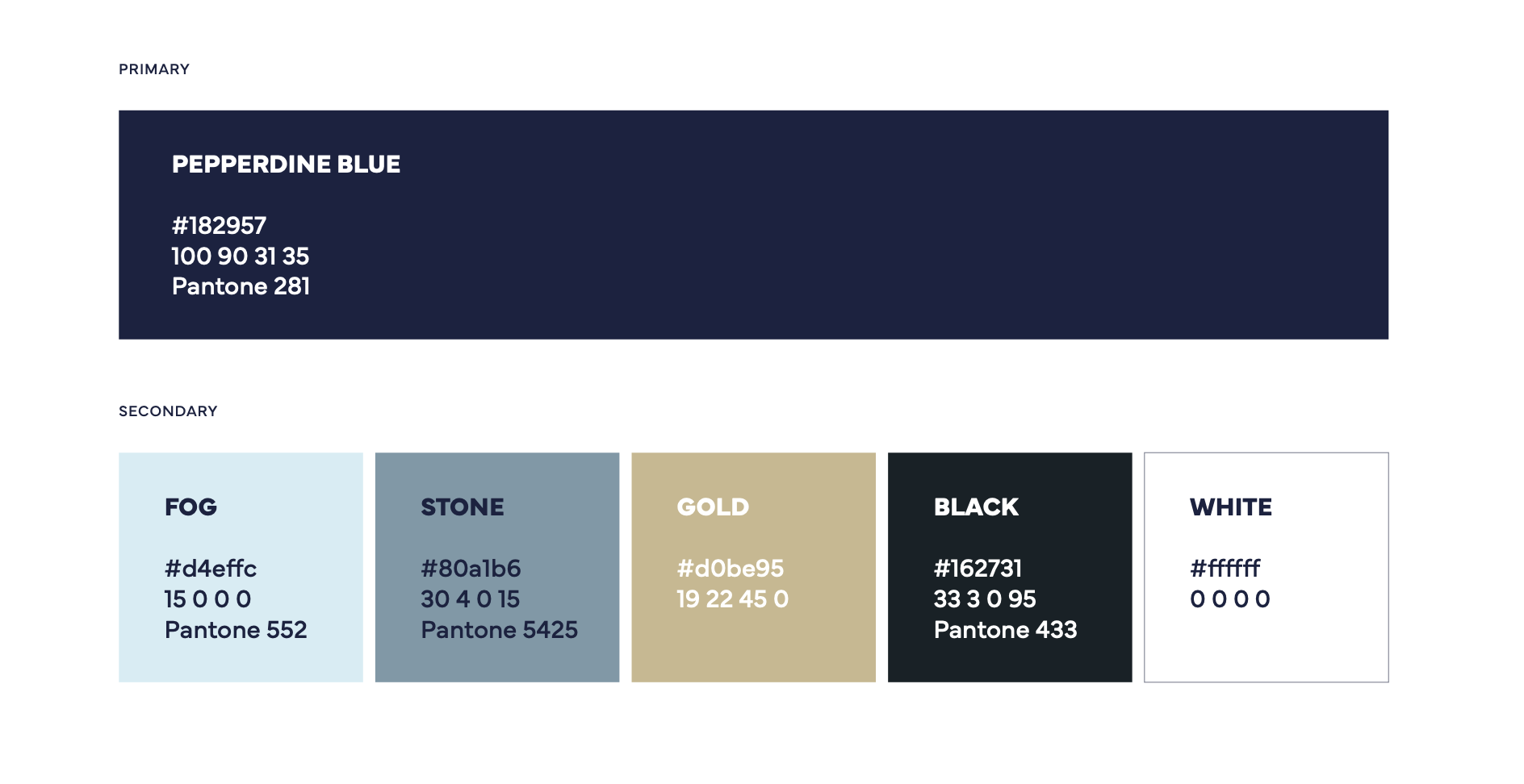
After meeting with the London team and refining the crest shape, typography, and style, we landed on a brand system that accomplished our goals: a fresh, modern look that embodied the city of London while paying homage to the flagship Malibu campus. The team was provided with a new color palette, style guides, and a wordmark system along with a collection of logos for print and web use.